Small cap mirage – running 16,500 investment strategy combinations over 20 years highlights the delusion of leveraging basic historical analysis for selecting small cap funds that consistently beat the index! Note that 20% of the funds reclassified themselves (some more than 4 times), there is marginal prediction power in performance measures (less than 1 in 5 chances), performance has struggled to beat the Russell 2000, Covid literally flipped the signals and yet, over the last decade the US Small Cap mutual fund market grew 2.5x!
For the US Small Cap mutual fund market, assuming the Russell 2000 as the index, there may be lesser value in basic historical price data analysis (and the derived performance measures) driven selection criterias. Forward looking analysis in Figure 9 shows the average market excess returns were 0.15%, 0.15% and 0.21% over the 1-2-3-year holding periods. With sampling, based on 40+ performance measures as illustrated in Table 2 there is less than 1 in 5 chance that the selection is in the top decile (depending on the performance measure used for selection and evaluation) and even this is highly regime dependent (see Figure 12). Further note that high average performance measure-based selection does not imply stable superior excess returns across all performance measures or periods. Nor does it imply that it’s the same funds that are top quartile.
So,
- You may want the Index. As a market (see Table1), at first blush it may seem there could be opportunities for individual fund selection to outperform the index. However, fund picking is extremely risky as the market seems to have an inner core of funds relative to the benchmark, with a layer of highly volatile funds comprising the top and bottom deciles (see Figure 12). Filtering out these volatile funds prior to security selection could see potential stable increase in return. But, the question becomes which ones and when? This seems like a mirage as there is no easy discernable allocation pattern (at least as shown by the brute force analysis of our 16,500 criteria runs).
- Top tier targeting maybe punitive. There is not a consistent relationship between the funds in the top percentiles of performance measures and the top percentiles of excess return. Measures like Fairway Average that seem to generate stable excess returns (see Figure 11), but still pose the question of selecting from the mix of 18-36 top decile funds (with wide performance dispersion between them).
- Steady returns may warrant middle tier targeting. Although counterintuitive, this somewhat smooths regimes plays with some give up of excess return. More consistent performers seem to lie in the middle quadrants and basing selection on performance measures that measure consistency seem to generate more stable outcomes (albeit by sacrificing returns). Overall, the performance measures with the most promise tend to focus on consistent but marginal excess return over the benchmark.
- Small Cap market is heavily driven by evaluation periods/regimes and not like you think! There is little to no consistent indication that any measure will outperform the benchmark in all market environments. As illustrated in Figure 12, the Covid transition matrix, the rankings of excess performance completely flipped. Investing in measure-based pre-Covid funds would have flipped to investments in the bottom performers very quickly. This indicates that even if there was a valid historical performance measure-based selection criterion, that criteria would have failed unless the change in regime could have been foreseen.
- Lack of Asset Class classification consistency. As illustrated in Figure 3, many funds failed to qualify for the set Small Cap criteria during different periods. This becomes more jumpy as more filtering criteria are included e.g., AUM of over [1] billion, existence of [3] years and declared as a US Fund Small [Blend, Growth, or Value] Categories. Many funds changed their investment prospectus to Large Cap and other alternative categories. This leads to the question of what are you truly is Small Cap investing, as in during the investment period these funds may fall out of your self determined qualifications of Small Cap.
- Difficult to justify value of paying additional fees. Do the incremental ‘allocator/distributor’ fees erode the generated Excess Return? We think so as the risk of finding the right fund is extremely high as the xbps of fees may not be worth it. Especially as at the market level the return ranges for the 1-3year holdings periods are 0.15% to 0.21%.
- Statistical disadvantages. There is no crystal ball for Fund selection and yet we have to evaluate 500+ funds over 20years+. This makes us highlight the issues surrounding statistical measures for assessing expected performance, where simplistic historical holistically applied analysis as is mostly the case can hide many issues. This makes Fund selection ripe for AI applications (but more on that in the subsequent pieces).
Note that since we want each of the Insights Historical Analysis pieces to be comparative and standalone, the framework and language is similar across the 2.10 Insights. We add some additional analytical color as we add new markets to highlight incremental optionality. As expected, the numbers and observations are market dependent.
When you are being pitched over 7,000 mutual funds1[1] (in the US alone), how do you know the selection motivations are aligned? Beyond the regulatorily mandated disclosures, the distributors/allocators generally point to the historical performance of the funds and/or forecasted performance under scenarios. This relies on two facets: (a) the benchmark(s) being considered, and (b) the performance measure being evaluated. In this Insights piece, we look at a popular benchmark for the particular Asset Class and the fund performance against that benchmark as measured by 40+ performance measures estimated on a historical basis. Since evaluating so many performance measures can be unwieldy, we also assess the performance via the performance measures unifying framework of Explainability Index (EI) and Risk of Target (RoT)[2].
Data
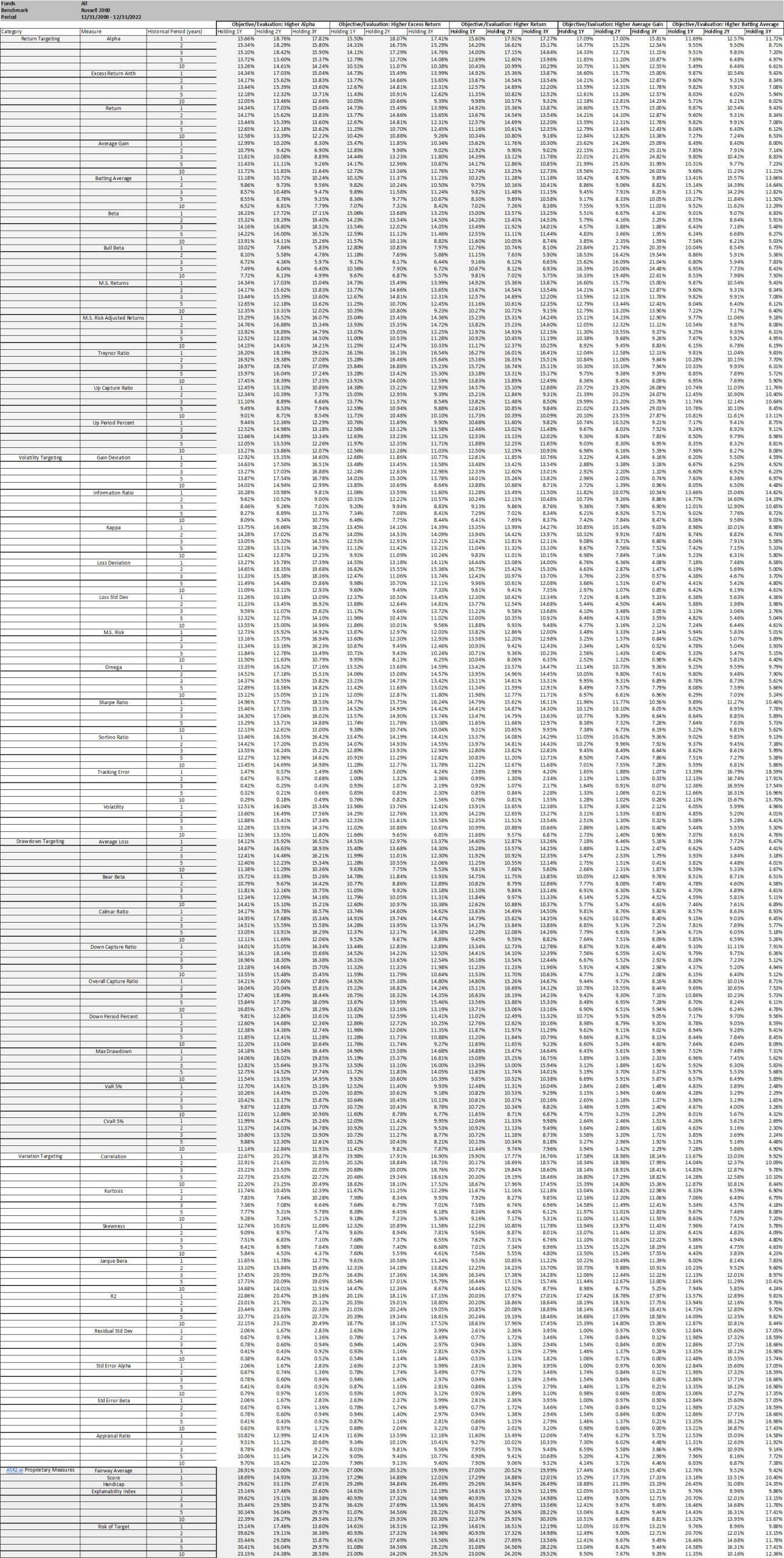
Within the larger mutual fund categorization 589 funds classified as Small Cap categorization at any time over the period 12/31/2000 – 12/31/2022 evaluation period. For some analysis, we filter the US mutual fund data that are categorized as US Small Cap, were at least 3 years old (considering 12/31/2000 – 12/31/2022 evaluation period), had over $ 1 billion in AUM and we evaluated the oldest share class. This filtering resulted in 139 funds in 2022 with a range of 24 – 149 for funds filtered for the analysis over the evaluation period) and is referred to as the Filtered dataset.
Analysis
As a reminder, this Insights piece is the first part of the journey, where both the assessment and evaluation are based on historical price data (and derived performance measures) for both fund and benchmarks. Issues such as the impact of time, classification, percentiles, and various historical and holding periods require careful consideration to identify the true drivers of excess return. The challenge of assessment is that all investment parameters are highly dependent on one another and the choice may depend on the choice of percentiles, performance measures, and the other investment parameters. To mitigate the dependence of investment parameters, we evaluate historical performance by permuting all possible strategies of investment and averaging its results. In this brute force analysis, a total of 16,560 investment strategies were evaluated by selecting a combination of:
- 1, 2, 3, 5, 10-year historical periods
- 1, 2, 3-year holding periods
- 46 performance measures
- The percentiles of each performance measures: Top 10%, Middle 80%, Bottom 10%
- AUM with and without a $1 billion fund AUM filter
- Life with and without a 3 years filter
- With and without category jumping qualifies in the correct category filter (assessed at the point of time or immediate category)
The results are based on aforementioned combinations.
1. MARKET PERFORMANCE
Although it is difficult (or irrational) to invest in all the funds, it is important to look at the entire market as you never know the performance of the specific fund you have invested in will be (so at a minimum it sets the overall expectations). Therein the point here is to give a datapoint without selection bias for the entire market (as filtered for the Asset Class above), where the alternative is to invest in the Index (directly or via a proxy).
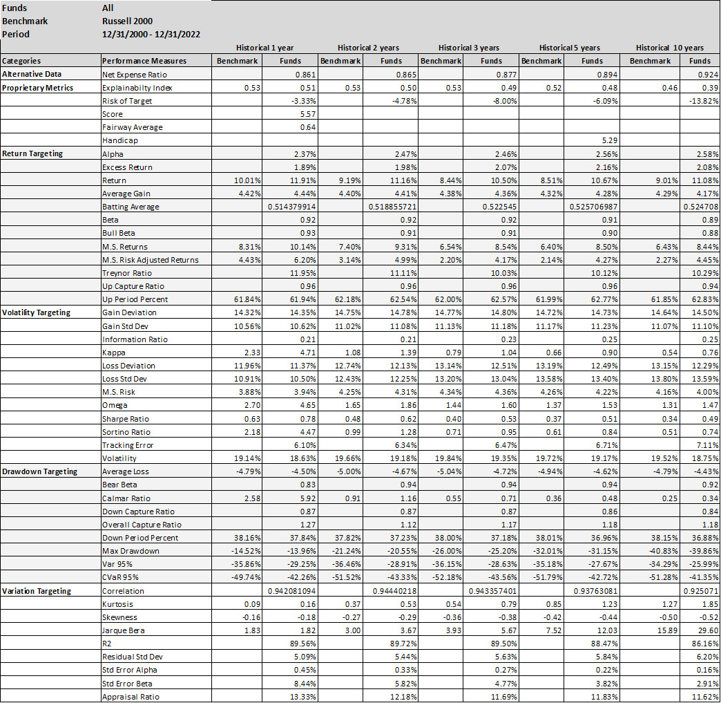
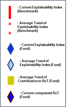
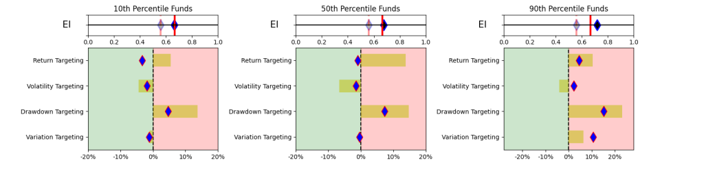
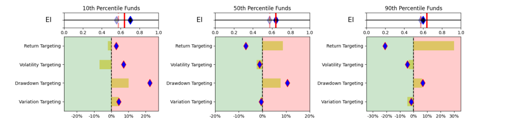
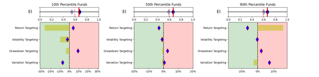
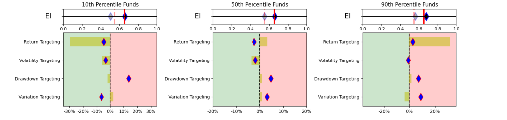
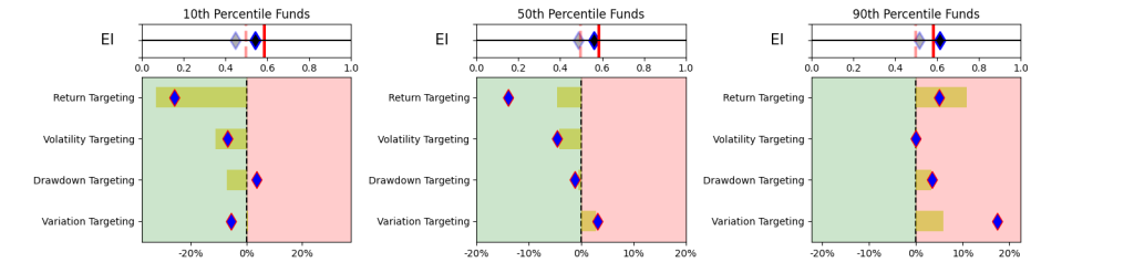
This simplistic look in Table 1 yields some promising results. A simpler and explainable way to digest and explain all the performance measures in Table 1 is to look at the Explainability Index Frameworks[3] presented in Figure 1. The framework highlights the performance measure facets of the Funds that are better or worse than the designated Index. Table 1 will largely correspond to the 50th percentile funds, where the performance is overlapping. The performance of the top quartile will correspond to Table 2, where the selection criteria can yield better performance. However, unlike Table 2 where the measure has 100% of the weight, here all categories are given a 25% or equal weight. Think of the Explainability Framework as a doctor’s report with the thermometer/temperature being the first order of assessment, followed by a set of category indicators of vitals. So, are you worse off than the target (as in more temperature than normal) and why (as in which measures are indicating deviations)?
As a market, illustrated in Figure 2, within the filtered dataset the number of Funds that have a higher return than the benchmark is extremely volatile. Averages over the 20-year period for the Asset Class show that 47-55% of the funds beat the Index. However, when you break the periods into parts then, until 2011 you had ~52% of the funds doing better, but since then the number has increased to a ~47% average (for the 1-,2- or 3-year hold periods). Whereas, the current NAV of funds (across all share classes) that beat the index was $419 bn (with total NAV of $580 bn) in 2022 versus NAV of $163 bn of the funds that beat the index in 2011 (with total NAV $ 212 bn).


One major issue with the Small Cap Asset Class is the reclassification by funds. As noted in Figure 3, a large portion of the funds are re-classifying themselves. Illustrates the type of reclassifications and the number of times the fund reclassified itself. If you are not a short-term investor then this raises questions about reliability and sustenance.

II. UNIQUE MARKERS
Within the broader market, the task becomes to try to identify funds that may ‘in the future’ outperform the market given a particular objective function. For example, as illustrated in Table 1, if the market can generate Excess Return over the Index (albeit with lower Sharpe) the question becomes how good a predictor is that performance measure itself (or others) as a marker for identifying individual funds that have a higher probability of outperformance for that objective function.
Herein, many studies have been conducted on methods of selecting the ‘better’ performing funds via leveraging various approaches. In this Insights piece, we remain focused on only using historical fund and benchmark performance data for trying to identify the ‘better’ performing funds. To assess the feature importance, we look at the performance measures as predictors from three perspectives,
- Performance Measures
- Distributional Shifts
- Regression
We conducted the analysis in this section on the filtered dataset. To keep this practical (as in easily implementable), we assess the performance over set holding periods (for 1, 2- or 3-year periods), without rebalancing (or frequent trading) and as measured across each of the performance measures as objective/evaluation criteria (versus some x factor (or such) model to assess alpha or other higher order value add). Further, since we cannot time the entry/exit we conduct the analysis on a rolling basis, where we use every month as a starting point for selection and ending point for the holding period. Final numbers are based on averages across the funds/months. It should be noted that the Tables in this Insights piece have a lot of embedded granularities (some of which we have tried to highlight in the Figures), but all are available upon request.With reference to the overall Insights journey, the selectors/allocators that are still exploring the more advanced financial engineering methods and/or jargon (or have limited alternative data access) will reside on a spectrum here by using some or a combination of the performance measures covered in Table 1 as their selection and evaluation criteria.
A. Performance Measures
The first approach becomes using each of the performance measures as a selection criteria for the funds. As a framework, since the allocation can be made at any time, the analysis in Table 2 is based on rolling performance assessment. Where, every month, we take the top decile funds based on the historic performance measure (for each of 1, 2-, 3-, 5- or 10-year periods) and then evaluate the percentage of funds remaining as the top decile selection at the end of the Investment Period (or 1, 2- or 3-years forward). Procedurally for
- Selection, we take the top quartile funds for the historical performance of each measure (for each of 1, 2-, 3-, 5- or 10-year historical periods) and hold them for each of the investment periods (for 1, 2- or 3-year holding periods). This is done on a monthly basis over the entire evaluation period so, depending on the performance measure the fund selection can change. Note that results in Table 2 are one directional as we feel all the permutations/combinations could make the point illustration unwieldy (e.g., positive excess return is good, but it is similarly possible that negative excess return is a better marker).
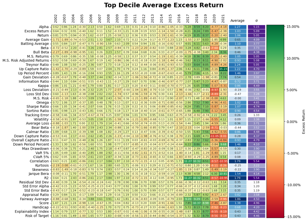
- Objective/evaluation – for each month, at the end of each investment period (for 1, 2- or 3-year holding periods), we calculate how many of the initially selected funds remain a top fund based on the same performance measure. We also evaluate if the selected funds remain a top fund based on all of the other performance measures. Table 2 illustrates results for Alpha (Higher), Excess Return (Higher) and Return (Higher) as the objective/evaluation criteria (where the results of all other categories and performance measures are available upon request).
Final percentages for the objective/evaluation are based on the averages. Note, over the evaluation period (from 2000-01-31 to 2022-12-31) if the fund had a track record lower than the historical evaluation period, the measure was evaluated from its inception.
From Table 2, depending on the performance measure selected there can have a 20% (not surprising to us, our proprietary measures did better than that!) chance of being in the top decile (under certain selection criteria, evaluation criteria and investment period). Further, it should be noted that it does not imply that it is the same funds that remain top quartile. It should be noted that using a combination of fixed performance measures and weights should generally give results within the performance measure ranges.
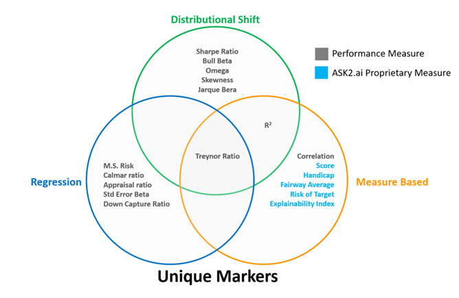
In assessing the performance measures listed in Table 1 we isolate the ones that exhibit higher success rate for the Intersection in Figure 8.
B. Distributional Shifts
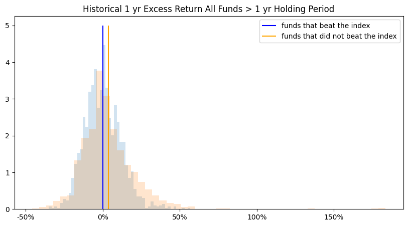
The second approach looks at the performance difference of the funds that beat the index versus the funds that did not beat the index. Herein, if certain funds did well then did their performance measures have any predictive value or show unique markers that make them better qualified for the selection. As an example, in Figures 5 we compare the distributions of funds that generated Excess Return over the index (at the end of the investment periods) with the funds that did not beat the index. Note Excess Return distributions are illustrative and they may not be a clear discerning marker.
To try to isolate the discerning markers we use a distributional shift transformation to select from all the features and time periods where funds that beat and do not beat the index differ the most. Distributional shift produces a score between 0-1 of the separation between distributions. This allows different performance measures to be compared on a standardized basis. The inputs of distributional shifts are the means and standard deviations of funds that beat and did not beat the market. The larger the separation between distributions, the higher the score. As illustrated in Figure 6. some measures show greater variability in the distributions. Certain features of the analysis were omitted from the distributional shift analysis due to the effects of outliers on estimation. The inputs of distributional shift are the means and standard deviations of funds that beat and did not beat the index. Thus, any measures susceptible to outlier influence will likely bias the distributional shift results. Arithmetic Treynor ratio and geometric information ratio were omitted due to outlier influence.
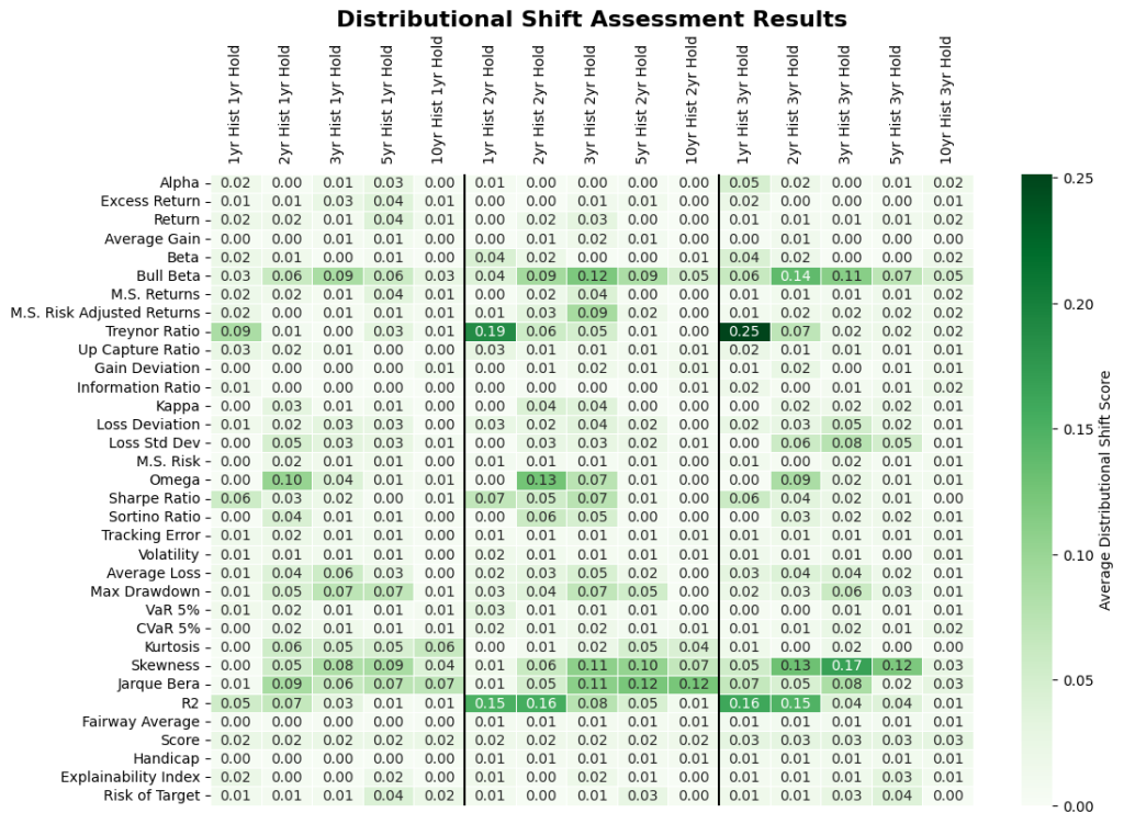
In assessing the distribution profiles of all performance measures listed in Table 1 and Figure 6 we isolate the ones that exhibit more pronounced differences for the Intersection in Figure 8.
C. Regression
The third method was to run a Logistic Regression with positive coefficients and averaged over the 12/31/2000 – 12/31/2022 evaluation period (figure 7). The higher the coefficient score, the more indication the individual performance measure and historical period is in determining higher fund return. Since the resulting coefficients are averaged over time, there could still be a high level of variability between coefficient results throughout the evaluation period.
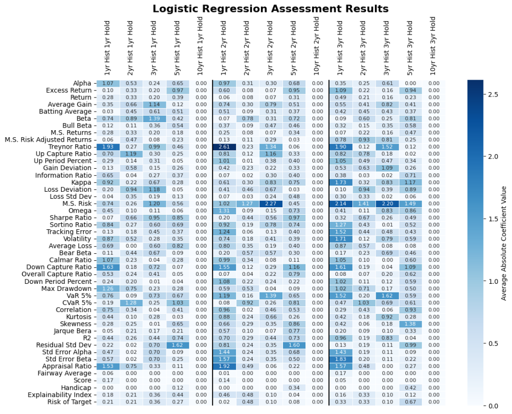
In assessing the Regression of all performance measures listed in Table 1 we isolate the ones that exhibit more pronounced results for the Intersection in Figure 8.
Summary
What does this mean? As illustrated in Figure 8, only one measure is a significant unique marker across the three assessment methods and if more assessments are included we can imagine the overlap may not be there.
Do they do well? We evaluate the identified unique markers on an out of sample, rolling basis. From Table 2, assuming we would have invested in the historic top decile funds as classified by the historic analysis of the select markers, where Figure 9 give the excess return of those funds after 1, 2- and 3-year holding periods. Note, average stands for investing equal weights in all of the identified top decile funds, worst stands for picking the worst fund in the top decile every time, and best stands for picking the best fund in the top decile every time. As a reminder, the results of all other performance measures are available upon request.
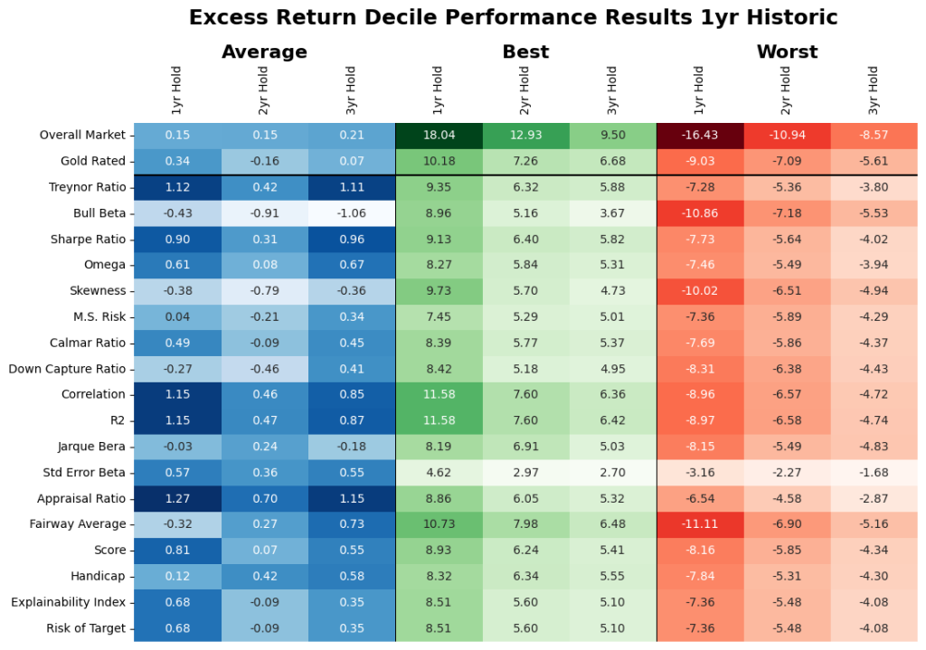
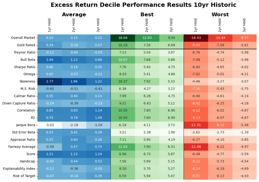
On average, we find that forward looking analysis reduced the average market results in Table 1 e.g., for the 3-year period it went from 2.07% to 0.21%. Here, if the identified unique measures were used then that result for the same periods would have been -1.31 to 0.96% depending on the criteria used. We find that the criteria that focus on stability (including our proprietary measures did better and this is also noted in the results exhibited in Table 2). However, note that this assumes that you invest in all the selected funds (could range from 18 – 36 funds) and the individual range of results within the criteria could be very wide.
III. FUND PERFORMANCE
We have been assessing the relationship between measures and funds in general. Here, we look at the funds themselves to assess how they individually did over their 20 year history? It should be noted that this analysis looks at the entire dataset (as in not only the filtered dataset).
At first blush, it seems some funds have the ability to generate average excess returns. Let us assess these funds by asking some questions.
1. Are excess returns stable? Maybe not, as is the curse of averages.
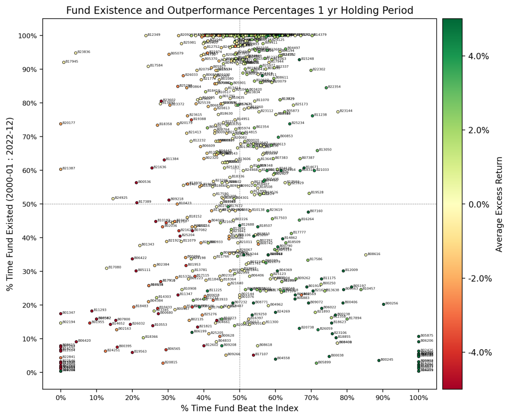
Figure 10 indicates a decent proportion of funds that have been in existence for some time exhibit excess returns over the benchmark. But, we noted in the previous section that there were no real markers so what could be the reasoning? A simple explanation is that the results are computed using the arithmetic average of excess returns throughout the evaluation period, and glazes over the volatility of the returns over the period (which could also be regime dependence). This poses an issue since it is not possible to time the entry-exit so, which part of the average is your investment on?
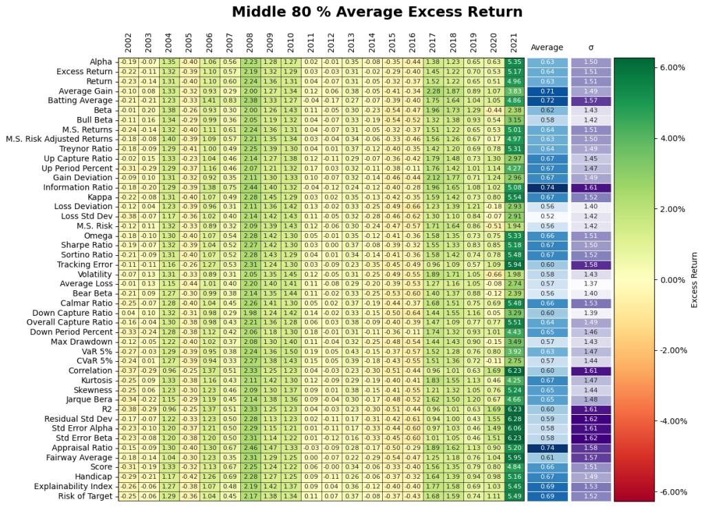
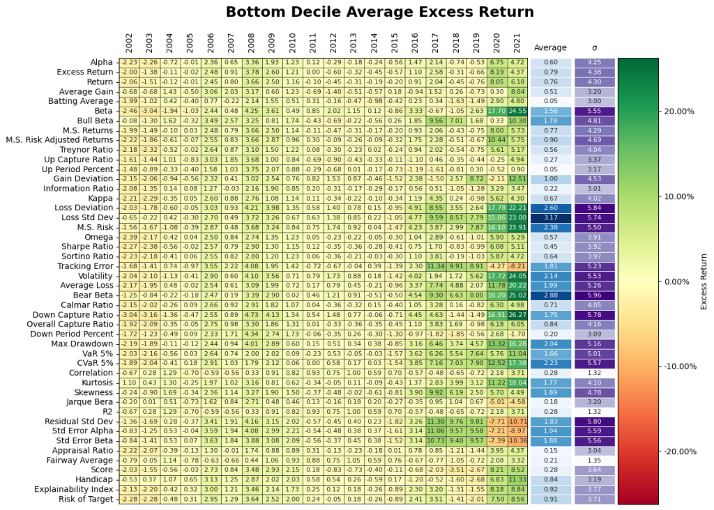
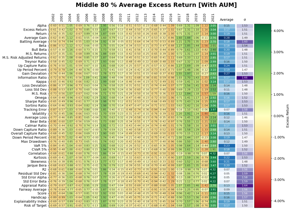
2. Does going after the top decile matter? Yes but, it may have the opposite effect of being punitive during certain periods! Figure 11 gives the results from the investment performance of the Top 10th, Middle 80th, and Bottom 10th percentiles yield some unique insights into the behavior of the Small Cap market. The top decile of funds underperformed the broader markets especially during Covid. It appears the shift in regime has flipped the ranking performance where the bottom decile of certain performance measures significantly during Covid. Overall, selection based on historical performance is uniformly dependent on regimes across all permutations of investment strategies.
. Are quartiles stable? No.
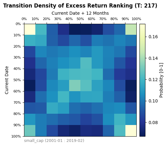
Figure 12 represents a transition matrix between deciles averaged over time periods. Essentially each square represents the historical probability of a fund in the current decile (Rows) winding ending up in the future decile (Columns) 1 year from then. The 4 corners seen in the transition matrix indicate that there is a connection between the bottom and top deciles between periods. This indicates that quartile targeting may be highly volatile in terms of performance. Higher quartile performers are not the next period higher quartile performers, especially during stressed periods. A more risk averse investment thesis could be to filter out the top and bottom deciles to focus more on the inner core of the Small Cap market.
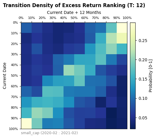
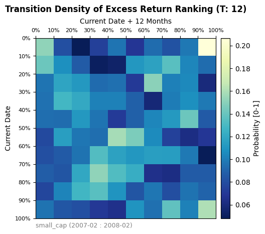
At a granular level, the transition matrix was also applied to examine the effects of the 2008 financial crisis and the Covid-19 Pandemic. Overall, the two time periods exhibit different performance when compared to the overall market transition matrix and to each other. The Covid transition matrix shows a sharp rank-flipping in excess return performance. This would indicate, on average, that the top performers prior to Covid became bottom performers afterwards and vice versa. The results from the 2008 recession show a more chaotic transition without as clear of a shape. Ultimately, while regimes can have a significant impact on the ranking of excess return performance, a wider categorization of regimes is required than simply separating time into a traditional bear/bull market type classification.
Covid-19 Pandemic Period
GFC Period
3. Do time periods matter? Yes.
Conditioning on the Middle 80th Percentile will give us a general assessment of Small Cap performance. As depicted below, the results from each measure show a heavy dependence upon time and regime, with outperformance strongest during the 2008 recession and the Covid-19 era. The graph below will serve as the benchmark of performance in which later question will reference. Furthermore, when regimes matter the performance measures do not matter.
4. Does AUM cutoff matter? Yes, but it maybe punitive
When comparing the results of figure 14, we see a substantial dropoff in average excess return over time. Therefore, on a historical basis, requiring funds to have an AUM > 1bn will see a decrease in overall excess return.
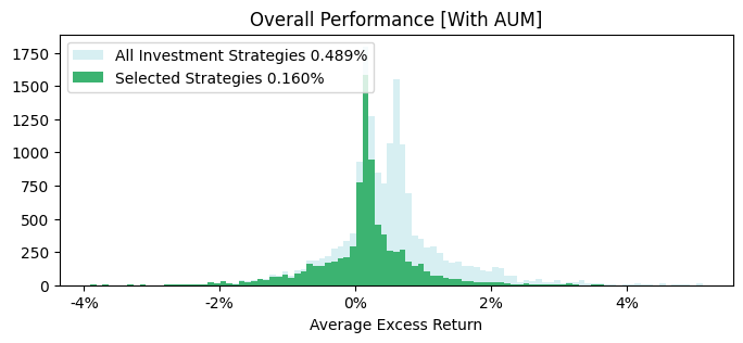
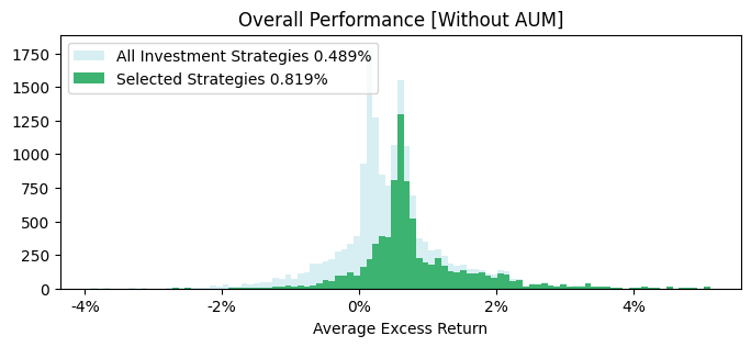
We also see the two peaks in excess return are dictated by the use of the AUM filter, where the distribution of fund performance without the AUM filter is better.
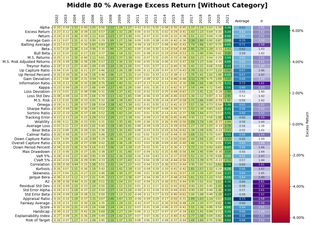
5. Does classification jumping matter? – Not for returns but, you many not get what you consistently want.
Does minimum life of existence matter? – Not for returns.
Figure 15 shows there is very little change in the results of category jumping. Thus, we can conclude that the category filter may not have as much of an impact on excess return. It should be noted that the lack of category filter is only including funds that have at least at one point qualified within the Small Cap category criteria. The same line of reasoning is applied to the requirement of the fund existing for longer than 3 years, where minimal change in overall performance for seasoned funds.

IV. FUND SELECTION
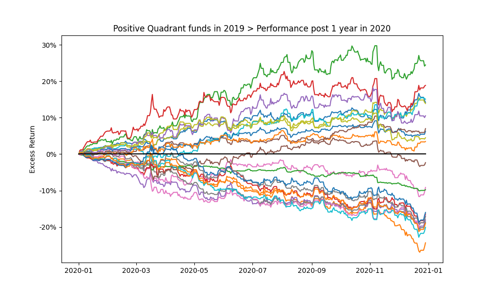
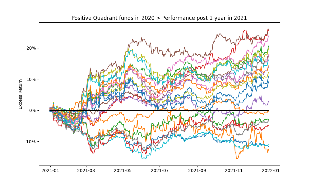
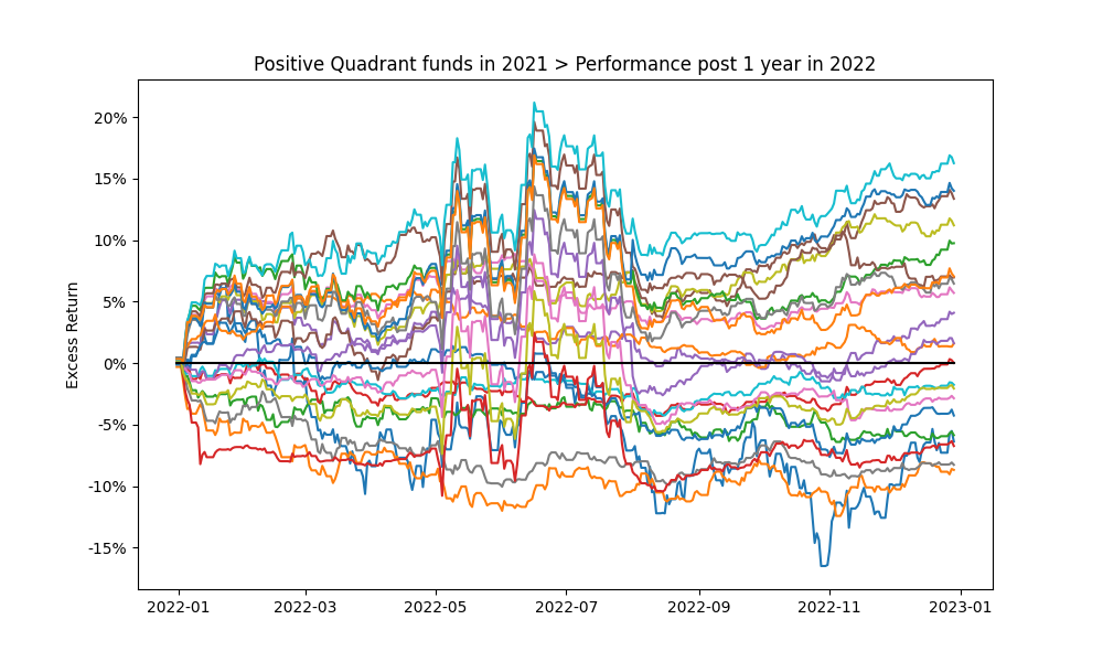
Looking at monthly rolling performance statistics has lots of embedded nuances, statistics and in general can be overwhelming. In this section, we do a point in time analysis, where we assume that the decisions were made on 2018-12-31 to select the funds. Again starting with the 3-year historical Excess Return, we assess the Total Return of the funds in 2019, 2020 and 2021.
Note that we had ascertained in the aforementioned analysis that the core middle group of funds selected based on stability measures may give better results. Hence, here we look at the middle 45-55% of the Fairway Average rated funds (selected from the total dataset).


As in Figure 17., looking at the performance of the top decile for funds selected on 2018-12-31 according to Excess Return shows that as expected many of the funds did not beat the Index in the subsequent years (future 1, 2 and 3 year periods).


Figure 18. Highlights the 1 year cumulative return profile funds in the positive quartile of the funds in Figure 17. Over shorter periods the future performance expectations of even the previous top performers is extremely volatile (even on a purely Excess Return basis).
The historic baseline analysis for the US Small Cap market indicates that investing in the Russell Small Cap TR USD index may be a more stable bet. Deriving true value requires a lot of what ifs for isolating feature and event importance as points of entry/exit can dramatically impact the results due to the volatility shown in the analysis. The what ifs are an anecdotal, experience based or iterative process as is expected from a fundamental or historic analysis. Consequently the permutations and combinations become unmanageable really fast, which is the achilles heel of baseline historical analysis. This makes it ripe for Machine Learning / Deep Learning models.
Contact us for information about a particular fund, performance measure, time period, etc.
REMINDER
Insights 2.00. Mutual Fund Manager Selection – Setting up the framework
Insights 2.10. Mutual Fund Manager Selection – Basic Historic Analysis: Are you always wrong?
We begin by holistically looking at the US mutual fund manager landscape from a historical fund price perspective and assess the ability of widely used performance measures for manager selection. This is done both at the market and individual fund level. Then as simple extensions we evaluate regressions for generally fixed weighting schemes of performance measures over fixed time periods and during discrete regimes. We look at simple back testing and predefined simulations. We will give Insights for every Asset Class.
Insights 2.20. Mutual Funds – Is there value in leveraging larger datasets?
We incorporate larger volumes of macro data, market data, performance measures, holding data, alternative data, etc. We introduce forms of feature engineering to generate signals for regimes, factors, indicators and measures using both raw and reduced datasets. We also introduce synthetic data generation to supplement sparse datasets.
Insights 2.30. Mutual Funds – Machine and Deep learning edge?
We incorporate evolving market conditions, performance measures, weights, events, predictions, etc. by leveraging Machine Learning techniques for real time and simulated multivariate analysis. Then we allow the system to do feature and event engineering by assessing various Deep Learning methods.
Extensions can be drawn to other types of managers, assets and markets. Here we will stay at the framework level, but will refer to our other papers that delve into the technical nuances and discoveries. Additionally, we will share similar series of Machine and Deep Learning framework papers for other aspects of the Investment lifecycle – asset allocation, portfolio management, risk management, asset planning, product development, etc.
These are all underpinnings of our Platform, where it is built to support any/all permutation/combination of data/models/visuals.
Email: info@ask2.ai for questions.
[1] 27,000+ if you assume all share classes. Also, not including SMAs, ETFs, etc.
[2] Hirsa, Ali and Ding, Rui and Malhotra, Satyan, Explainability Index (EI): Unifying Framework of Performance Measures and Risk of Target (RoT): Variability from Target EI (January 23, 2023). Available at SSRN: https://ssrn.com/abstract=4335455
[3] The current is based on annualized over a (x)yr period and the average is based on rolling the (x)yr window every year for 20yrs; we assess the fund/portfolio as of the last evaluation date rolled back. Analysis assumptions: Measures: Absolute. Time Variation: No. Threshold/Scale: Market Index. Categories: Yes. Weights: Equal. Type: Arithmetic. 50th percentile defined as 45-55%.