Pretty much – more than 75% of the time. Unfortunately, with reference to the SP500 TR USD you will only be selecting top performers maybe 25% of the time (depending on the measures and evaluation criteria). Irrespective, over the last decade the US Large Cap mutual fund market grew 4x despite average relative poor performance versus the Index – $8 Trillion chasing fool’s gold? For the overall US Large Cap mutual fund market, assuming the SP500 TR USD as the index, there may be lesser value in looking at historical price data (and the derived performance measures) as selection criteria. As illustrated in Table 1, the overall market (without sampling) generated a 0.17 – 0.26% average annualized excess return over the Index (for each of 1, 2-, 3-, 5- or 10-year periods over the 12/31/2000 – 12/31/2022 evaluation period). With sampling, based on 40+ performance measures as illustrated in Table 2, there can be 25% of the funds that are top quartile (depending on the performance measure used for selection and evaluation) that generated 0.6-0.8% average annual excess return (ranged 15.7% – (13.1)%) over the 1-2-3 year holding periods (here Excess Return as a selection criteria). However, high performance measure-based selection does not imply stable superior excess returns across all performance measures or periods. Nor does it imply that it’s the same funds that are top quartile.
But,
- You may want the Index. The high R2, low Alpha and high Beta of the Funds implies that the funds in general are too aligned with the Index (SP500 TR USD) so, is it worth it for the marginal Excess Return to have a lower Sharpe (or higher volatility) (see Table 1)?
- Do the incremental ‘allocator/distributor’ fees erode the generated Excess Return? If the fees you pay are below 0.16% then as a market or via superior fund selection you may be marginally better off (assuming Excess Return is your only objective function).
- Which performance measures do you value more/less? Some performance measures have promising distributions as selection criteria and can generate marginally more average excess returns (increase from 0.16% to 0.30%). The Explainability Index and Risk of Target (Image 1) gives a control panel for incorporating multiple performance measures.
- Can you dig deeper for fund level granularity? This is insightful for assessing funds that may be ‘better’ over time, during certain times/regimes, only in certain markets, against certain benchmarks, at time of entry/exit (given the demonstrated over/under performance), etc. As in Event and Feature Engineering (yes, this Insights piece is basic simpler historical analysis, but we point this out as these questions may be coming up and will be covered in the journey’s next pieces (where more data is ingested and ML/DL is applied to beyond canned what ifs).
When you are being pitched over 7,000 mutual funds1[1] (in the US alone), how do you know the selection motivations are aligned? Beyond the regulatorily mandated disclosures, the distributors/allocators generally point to the historical performance of the funds and/or forecasted performance under scenarios. This relies on two facets: (a) the benchmark(s) being considered, and (b) the performance measure being evaluated. In this Insights piece, we look at a popular benchmark for the particular Asset Class and the fund performance against that benchmark as measured by 29 estimated on a historical basis. Since evaluating so many performance measures can be unwieldy, we also assess the performance via the performance measures unifying framework of Explainability Index (EI) and Risk of Target (RoT)[2].
Note that since we want each of the Insights Historical Analysis pieces to be comparative and standalone, the framework and language is similar across the 2.10 Insights. We add some additional analytical color as we add new markets to highlight incremental optionality. As expected, the numbers and observations are market dependent.
Data
We filter the US mutual fund data that are categorized as US Large Cap (US Large Cap), were at least 3 years old (considering 12/31/2000 – 12/31/2022 evaluation period), had over $ 1 billion in AUM and we evaluated the oldest share class. This filtering resulted in 480 funds in 2022 with a range of 143 – 481 for funds filtered for the analysis over the evaluation period).
Analysis
As a reminder, this Insights piece is the first part of the journey, where both the assessment and evaluation are based on historical price data (and derived performance measures) for both fund and benchmarks. Refer to the Explainability Index paper in footnote 2 for the methodology used for estimating the performance measures and all other calculations.
US Large Cap Market
Although it is difficult (or irrational) to invest in all the funds, it is important to look at the entire market as you never know the performance of the specific fund you have invested in will be (so at a minimum it sets the overall expectations). Therein the point here is to give a datapoint without selection bias for the entire market (as filtered for the Asset Class above), where the alternative is to invest in the Index (directly or via a proxy).
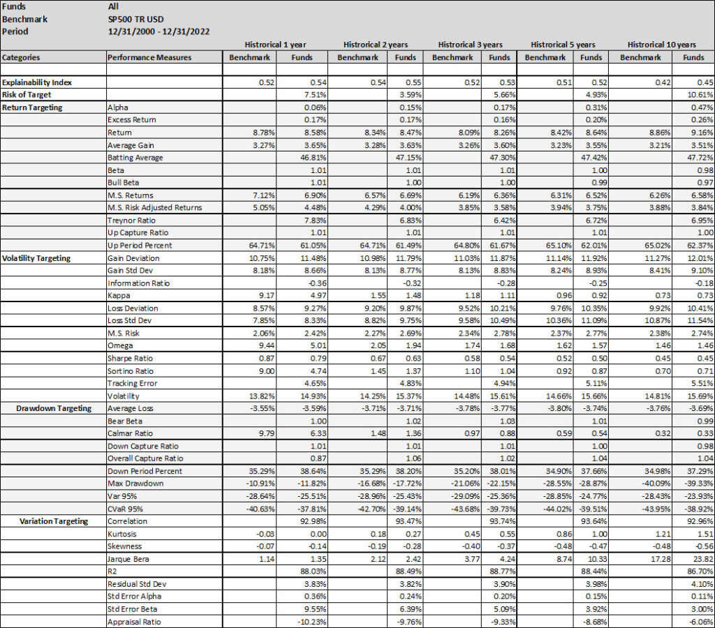
A simpler and explainable way to digest and explain all the performance measures in Table 1 is to look at the Explainability Index Frameworks presented in Illustration 1. The framework highlights the performance measure facets of the Funds that are better or worse than the designated Index. Table 1 will largely correspond to the 50th percentile funds, where the performance is overlapping. The performance of the top quartile will correspond to Table 2, where the selection criteria can yield better performance. However, unlike Table 2 where the measure has 100% of the weight, here all categories are given a 25% or equal weight. Think of the Explainability Framework as a doctor’s report with the thermometer/temperature being the first order of assessment, followed by a set of category indicators of vitals. So, are you worse off than the target (as in more temperature than normal) and why (as in which measures are indicating deviations)?
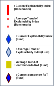
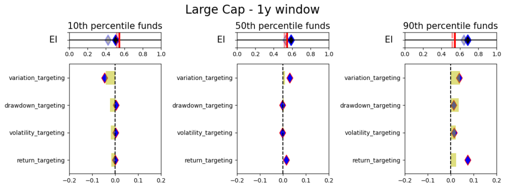
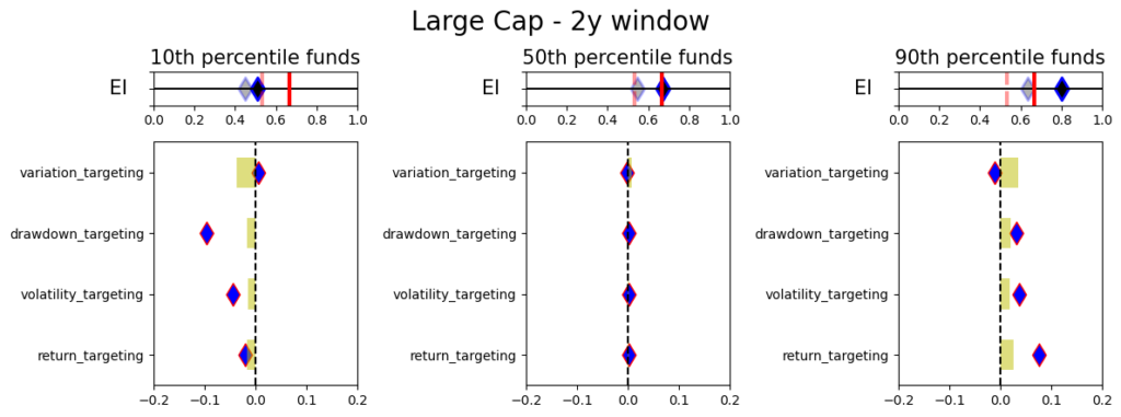
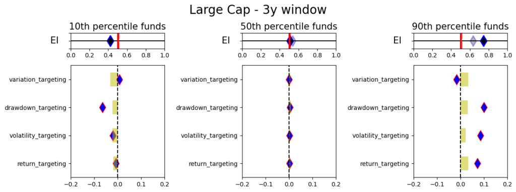
The Explainabilty Framework bridges the final engineering jargon to illustrate and/or manage the performance measures as a control panel per what is important for the selector/allocator. More on its usages in Insights 2.00
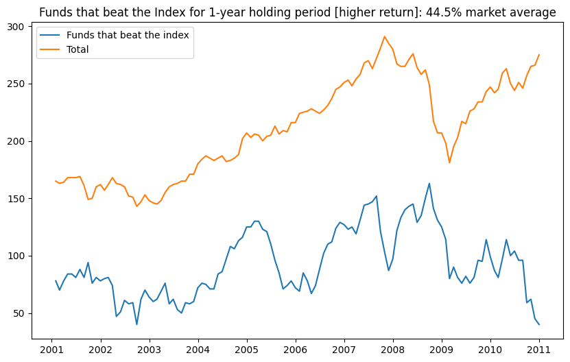
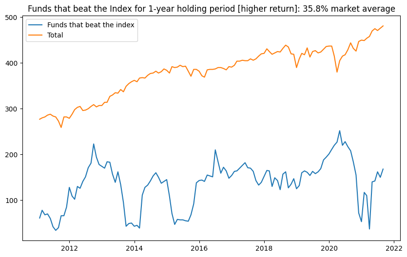
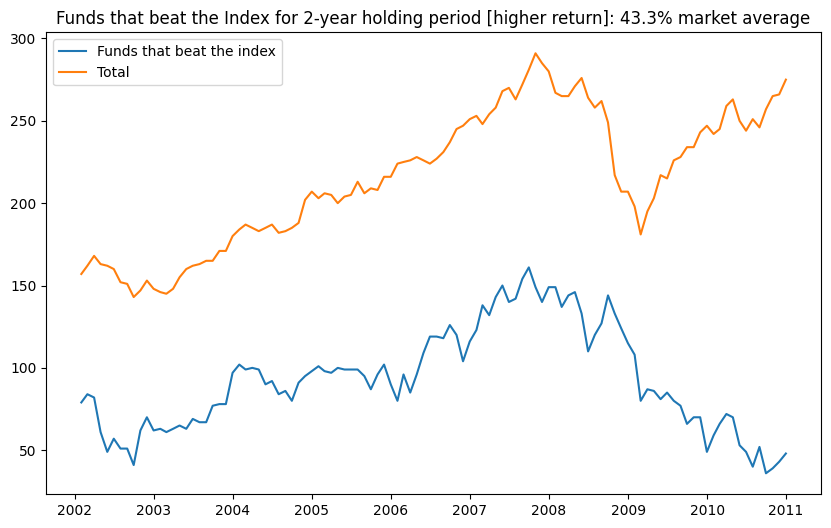
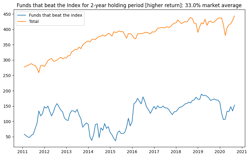
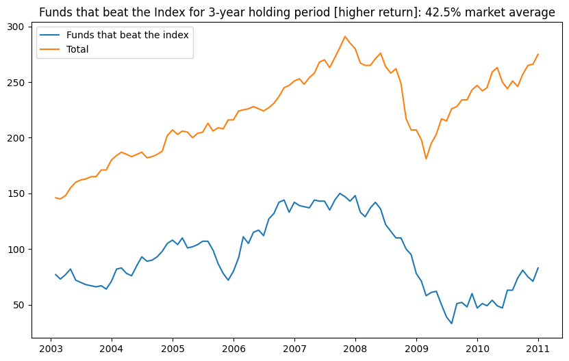
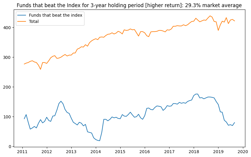
As illustrated in Figures 1, 2 and 3, the number of Funds that have a higher return than the benchmark is extremely volatile. Averages over the 20-year period for the Asset Class show that 35-40% of the funds beat the Index, which is high. However, when you break the periods into parts then, until 2011 you had 40%+ of the funds doing better, but since then the number has been dropping to a 30s average (for the 1-,2- or 3-year hold periods). Whereas, the current NAV of funds (across all share classes) that beat the index was $1.6Tr bn (with total NAV of $8.1Tr bn) in 2022 versus NAV of $232Bn of the funds that beat the index in 2011 (with total NAV $2Tr). So the market grew 4x despite relative poor performance versus the Index.
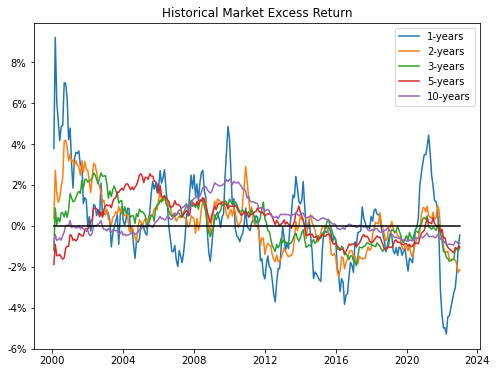
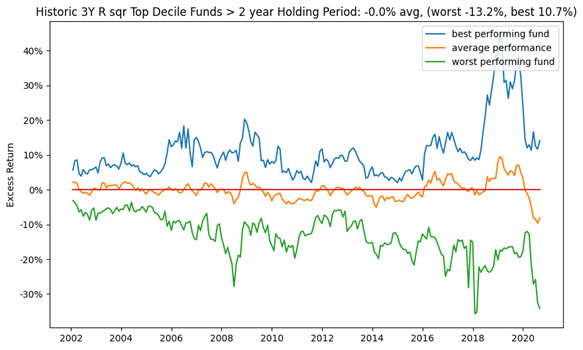
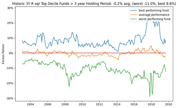
Figures 4 & 5 look more granularly at the two of the more widely assessed performance measures – Excess Return and Relative Max Drawdown (RMDD). In Figure 4. Excess Return exhibits periods of excessive over or under performance depending on the historic window. Overall, shorter term historic periods show a lot of cyclicality and longer-term periods are more consistent. However, in general, the US Large Cap funds over the last decade have done a poorer job than the Index.
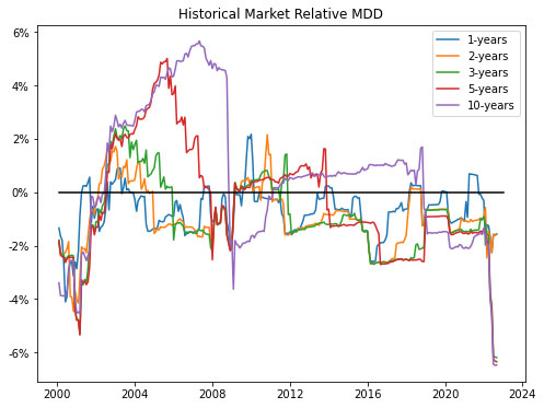
In Figure 5 the relative MDD shows more volatility especially in the pre 2011 period, where the funds outperformed the Index. More recently, as also seen in Table 1. the relative MDD has been poorer than the Index, but since the timing of the drawdowns is not perfectly correlated it is less sticky.
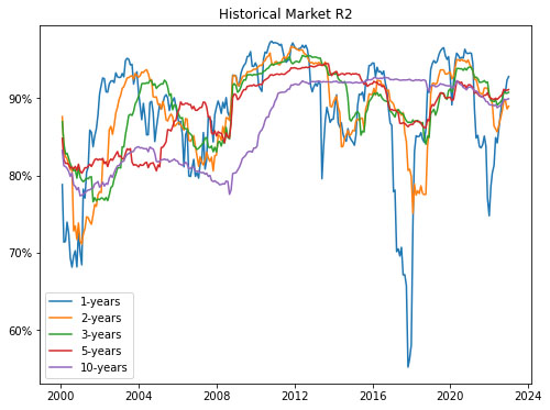
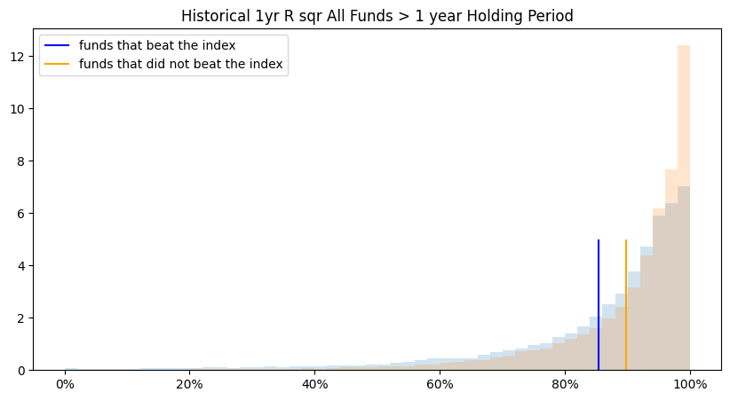
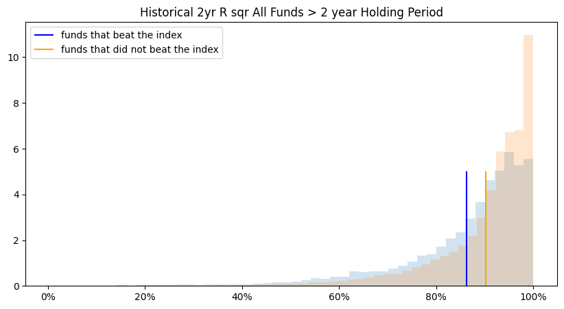
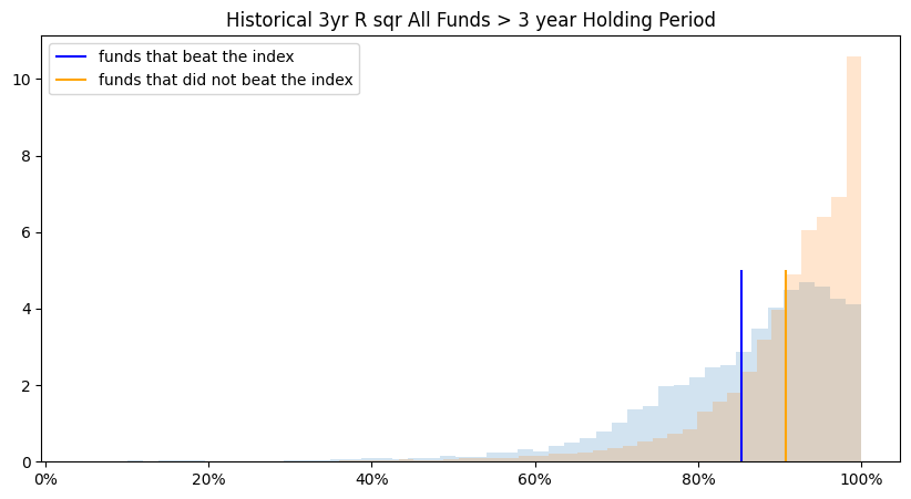
In Figure 6, we see that the funds have a relatively high R2 implying that the managers are in line with the Index (except over shorter periods). As in Table 1. this is the lower Excess Return, lower Alpha and high Beta in the overall market.
US Large Cap Market > Fund Selection (Rolling)
Within the broader market, the task becomes to try to identify funds that may ‘in the future’ outperform the market given a particular objective function. For example, as illustrated in Table 1, if the market can generate marginal Excess Return over the Index (albeit with lower Sharpe) the question becomes how good a predictor is that performance measure itself (or others) as a marker for identifying individual funds that have a higher probability of outperformance for that objective function. Further, since we cannot time the entry/exit we conduct the analysis on a rolling basis, where we use every month as a starting point for selection and ending point for the holding period. Final numbers are based on averages across the funds/months. It should be noted that the Tables in this Insights piece have a lot of embedded granularities (some of which we have tried to highlight in the Figures), but all are available upon request. With reference to the overall Insights journey, the selectors/allocators that are still exploring the more advanced financial engineering methods and/or jargon (or have limited alternative data access) will reside on a spectrum here by using some or a combination of the performance measures covered in Table 1 as their selection and evaluation criteria.
Herein, many studies have been conducted on methods of selecting the ‘better’ performing funds via leveraging various approaches. In this Insights piece, we remain focused on only using historical fund and benchmark performance data for trying to identify the ‘better’ performing funds. Further, to keep this practical (as in easily implementable), we assess the performance over set holding periods (for 1, 2- or 3-year periods), without rebalancing (or frequent trading) and as measured across each of the performance measures as objective/evaluation criteria (versus some x factor (or such) model to assess alpha or other higher order value add).
As a framework, since the allocation can be made at any time, the analysis in Table 2 is based on rolling performance assessment. Where, every month, we take the top decile funds based on the historic performance measure (for each of 1, 2-, 3-, 5- or 10-year periods) and then evaluate the percentage of funds remaining as the top decile selection at the end of the Investment Period (or 1, 2- or 3-years forward). Procedurally for
- Selection, we take the top quartile funds for the historical performance of each measure (for each of 1, 2-, 3-, 5- or 10-year historical periods) and hold them for each of the investment periods (for 1, 2- or 3-year holding periods). This is done on a monthly basis over the entire evaluation period so, depending on the performance measure the fund selection can change. Note that results in Table 2 are one directional as we feel all the permutations/combinations could make the point illustration unwieldy (e.g., positive excess return is good, but it is similarly possible that negative excess return is a better marker).
- Objective/evaluation – for each month, at the end of each investment period (for 1, 2- or 3-year holding periods), we calculate how many of the initially selected funds remain a top fund based on the same performance measure. We also evaluate if the selected funds remain a top fund based on all of the other performance measures. Table 2 illustrates results for Alpha (Higher), Excess Return (Higher) and Return (Higher) as the objective/evaluation criteria (where the results of all other categories and performance measures are available upon request).
Final percentages for the objective/evaluation are based on the averages. Note, over the evaluation period (from 2000-01-31 to 2022-12-31) if the fund had a track record lower than the historical evaluation period, the measure was evaluated from its inception.
Overall depending on the performance measure selected there can be an up to 25% chance of being in the top decile (under certain selection criteria, evaluation criteria and investment period). Further, it should be noted that it does not imply that it is the same funds that remain top quartile. It should be noted that using a combination of fixed performance measures and weights should generally give results within the performance measure ranges.
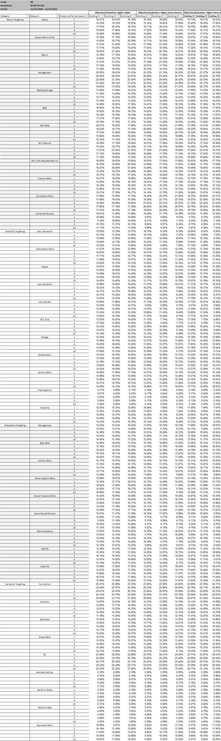
For a more granular analysis, let’s assess the historic Excess Return as a predictor. As a reminder, the results of all other performance measures are available upon request. From Table 2, assuming we would have invested in the top decile funds as classified by the historic 3-year analysis, where Figure 7, 8 and 9 give the performance of those funds after 1, 2- and 3-year holding periods. Note, average stands for investing equal weights in all of the identified top decile funds, worst stands for picking the worst fund in the top decile every time, and best stands for picking the best fund in the top decile every time.
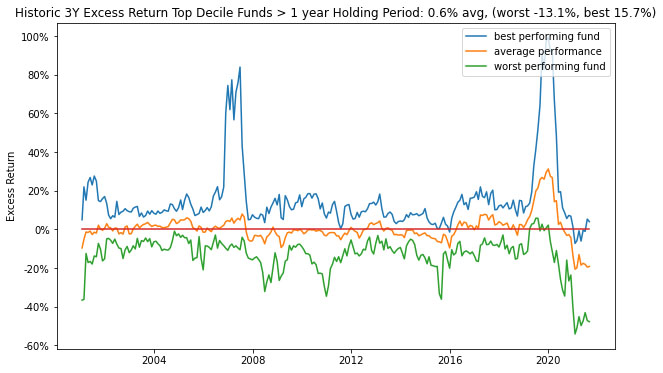
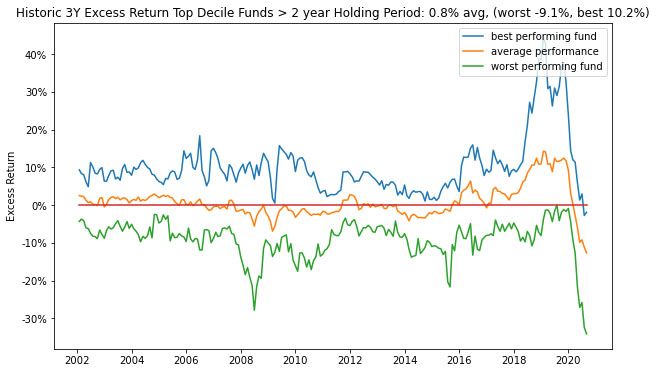
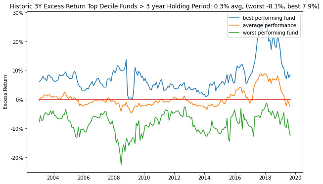
On average, we find that using just historic (3-year) Excess Return as a selection and evaluation criterion for the increases the selection Excess Return value from 0.16% to 0.30% (with a 7.9% to a -8.1% range) and similarly for other periods (assuming impact on other performance measures are not considered). That is an improvement, however the range is very wide even for the historic top performer’s future performance so unless investing in all the top quartile funds is an option this may be a risky strategy.
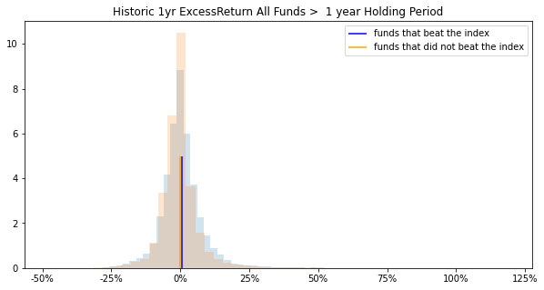
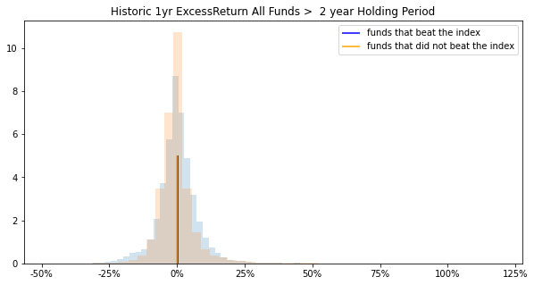
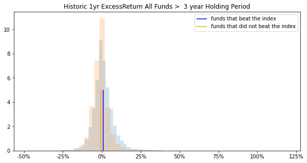
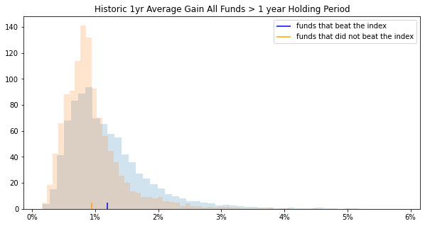
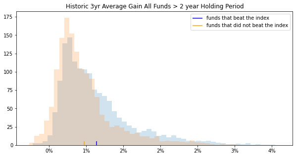
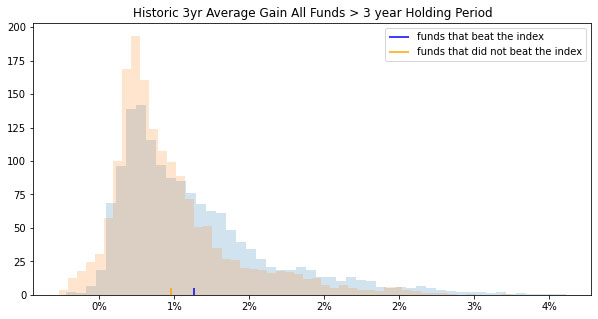
Feature Importance – if there is implied value in generally using the performance measures, then the question becomes if any of the performance measures show unique markers that make them better qualified for the selection. As an example, in Figures 10, 11 and 12, we compare the distributions of funds that generated Excess Return over the index (at the end of the investment periods) with the funds that did not beat the index. Figures 10, 11 and 12 show that Excess Return distributions may not be a clear discerning marker.
We use a distributional shift transformation to select from all the features and time periods where funds that beat and do not beat the index differ the most. Distributional shift produces a score between 0-1 of the separation between distributions. This allows different performance measures to be compared on a standardized basis. The inputs of distributional shifts are the means and standard deviations of funds that beat and did not beat the market. The larger the separation between distributions, the higher the score. As illustrated in Figure 13. some measures show greater variability in the distributions. Certain features of the analysis were omitted from the distributional shift analysis due to the effects of outliers on estimation. The inputs of distributional shift are the means and standard deviations of funds that beat and did not beat the index. Thus, any measures susceptible to outlier influence will likely bias the distributional shift results. Arithmetic Treynor ratio and geometric information ratio were omitted due to outlier influence.
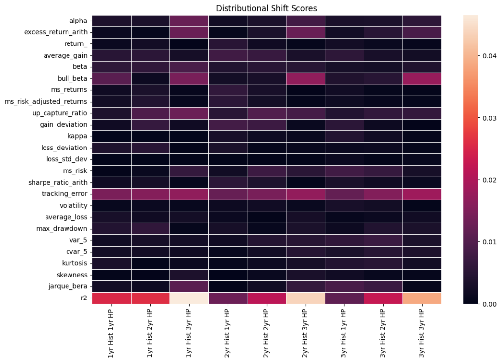
In assessing the distribution profiles of all performance measures listed in Table 1 and Figure 13 we isolate the ones that exhibit more pronounced differences (as illustrated in Figures 14 – 23).
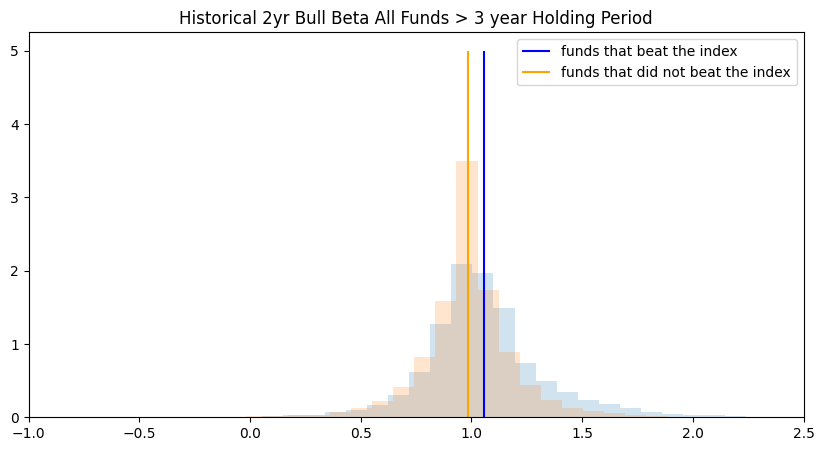
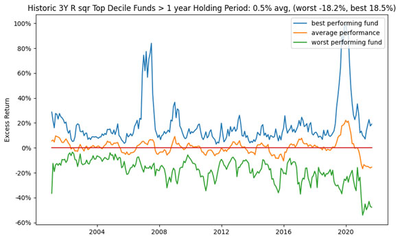
If certain features show importance then does it translate into them being better markers for selecting ‘better’ performing funds in the future? As an illustration, since we find R2 to have a unique marker, we assess the Excess Returns based on using the 3-year historic R2 performance as a selection criteria (Figures 24 – 26). On average, we find that using just historic (3-year) R2 as a selection and evaluation criterion for the increases the selection Excess Return value from 0.16% to 0.50% (albeit the average drops to -.02% over a 3-year hold period). Assuming impact on other performance measures are not considered. The range is very wide even for the historic top performer’s future performance so unless investing in all the top quartile funds is an option this may be a risky strategy.
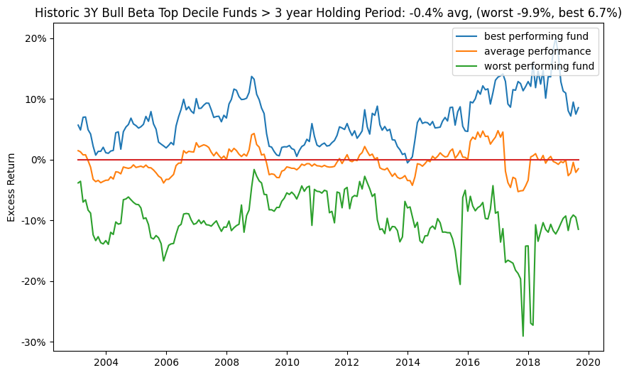
With 3-year Tracking Error and Bull Betas as a selection criteria (Figures 27 – 32), on average, the selection Excess Return value drops from 0.16% to negative. Assuming impact on other performance measures are not considered.
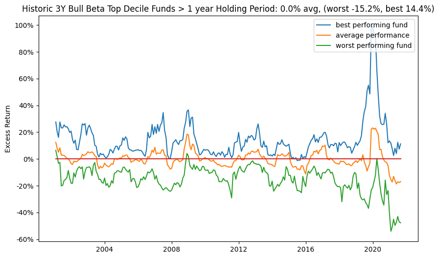
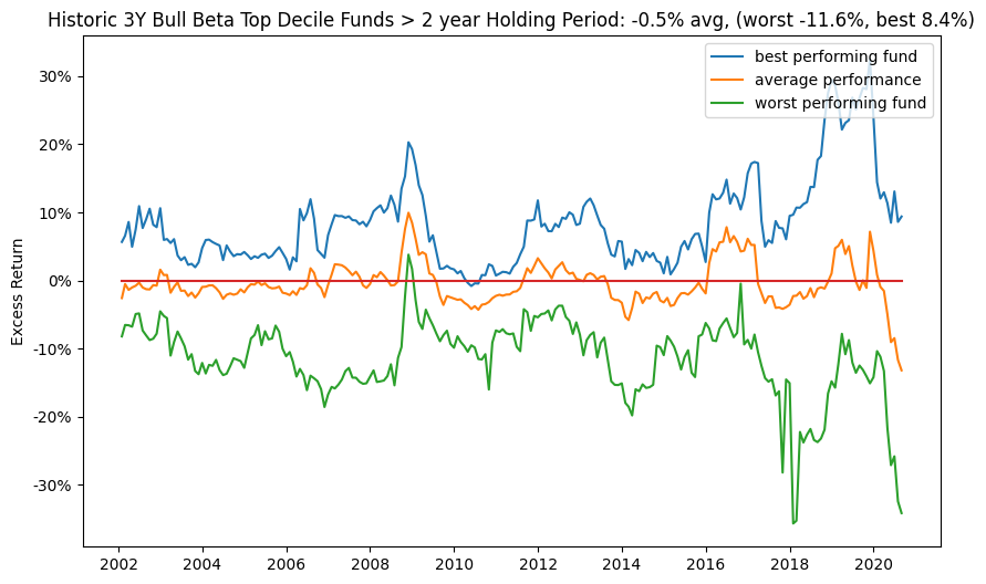
For some of these unique marker measures, since the distribution is wide it implies that although in Table 2 they have a high percentage of top quartile the funds that do not make it do a lot worse than some of the other weak top quartile predictors.
US Large Cap Market > Fund Selection (point in time)
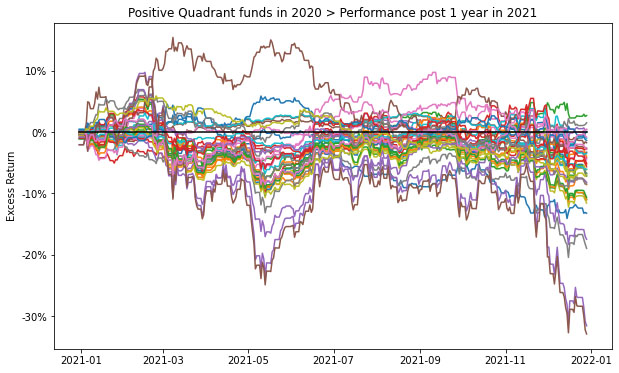
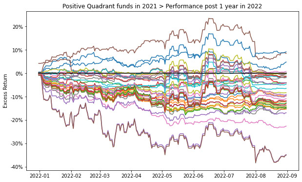
Looking at monthly rolling performance statistics has lots of embedded nuances, statistics and in general can be overwhelming. In is section, we do a point in time analysis, where we assume that the decisions were made on 2018-12-31 to select the top decile funds based on the 3-year historic Excess Return and we assess the Total Return of the funds in 2019, 2020 and 2021 (as illustrated in Figures 33-35).
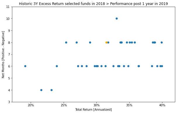
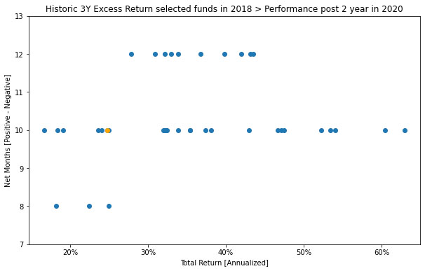
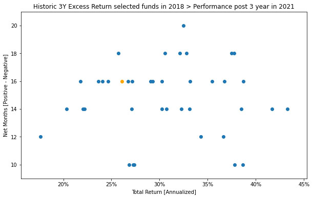
Looking at the performance of the top decile for funds selected on 2018-12-31 according to Excess Return (Figures 36, 37 and 38) shows that as expected many of the funds did not beat the Index in the subsequent years (future 1, 2 and 3 year periods).
Figure 39 looks at 1 year cumulative return profile funds in the positive quartile of the funds in Figure 36. And, Figures 40 and 41 for the funds in Figure 37 and 38. Over shorter periods the future performance expectations of even the previous top performers is extremely volatile (even on a purely Excess Return basis).
The historic baseline analysis for the US Large Cap market indicates that investing in the SP500 TR USD index may be a more stable bet. Deriving true value requires a lot of what ifs for isolating feature and event importance as points of entry/exit can dramatically impact the results due to the volatility shown in the analysis. The what ifs are an anecdotal, experience based or iterative process as is expected from a fundamental or historic analysis. Consequently the permutations and combinations become unmanageable really fast, which is the achilles heel of baseline historical analysis.
Contact us for information about a particular fund, performance measure, time period, etc.
Background
Insights 2.00. Mutual Fund Manager Selection – Setting up the framework
Insights 2.10. Mutual Fund Manager Selection – Basic Historic Analysis: Are you always wrong?
We begin by holistically looking at the US mutual fund manager landscape from a historical fund price perspective and assess the ability of widely used performance measures for manager selection. This is done both at the market and individual fund level. Then as simple extensions we evaluate regressions for generally fixed weighting schemes of performance measures over fixed time periods and during discrete regimes. We look at simple back testing and predefined simulations. We will give Insights for every Asset Class.
Insights 2.20. Mutual Funds – Is there value in leveraging larger datasets?
We incorporate larger volumes of macro data, market data, performance measures, holding data, alternative data, etc. We introduce forms of feature engineering to generate signals for regimes, factors, indicators and measures using both raw and reduced datasets. We also introduce synthetic data generation to supplement sparse datasets.
Insights 2.30. Mutual Funds – Machine and Deep learning edge?
We incorporate evolving market conditions, performance measures, weights, events, predictions, etc. by leveraging Machine Learning techniques for real time and simulated multivariate analysis. Then we allow the system to do feature and event engineering by assessing various Deep Learning methods.
Extensions can be drawn to other types of managers, assets and markets. Here we will stay at the framework level, but will refer to our other papers that delve into the technical nuances and discoveries. Additionally, we will share similar series of Machine and Deep Learning framework papers for other aspects of the Investment lifecycle – asset allocation, portfolio management, risk management, asset planning, product development, etc.
These are all underpinnings of our Platform, where it is built to support any/all permutation/combination of data/models/visuals.
Email: info@ask2.ai for questions.
NEXT
Insights 2.12. Mutual Fund Manager Selection – Basic Historic Analysis: Are you always wrong?
Focus: US MId Cap Mutual Funds
[1] 27,000+ if you assume all share classes. Also, not including SMAs, ETFs, etc.
[2] Hirsa, Ali and Ding, Rui and Malhotra, Satyan, Explainability Index (EI): Unifying Framework of Performance Measures and Risk of Target (RoT): Variability from Target EI (January 23, 2023). Available at SSRN: https://ssrn.com/abstract=4335455
[3] The current is based on annualized over a (x)yr period and the average is based on rolling the (x)yr window every year for 20yrs; we assess the fund/portfolio as of the last evaluation date rolled back. Analysis assumptions: Measures: Absolute. Time Variation: No. Threshold/Scale: Market Index. Categories: Yes. Weights: Equal. Type: Arithmetic. 50th percentile defined as 45-55%.